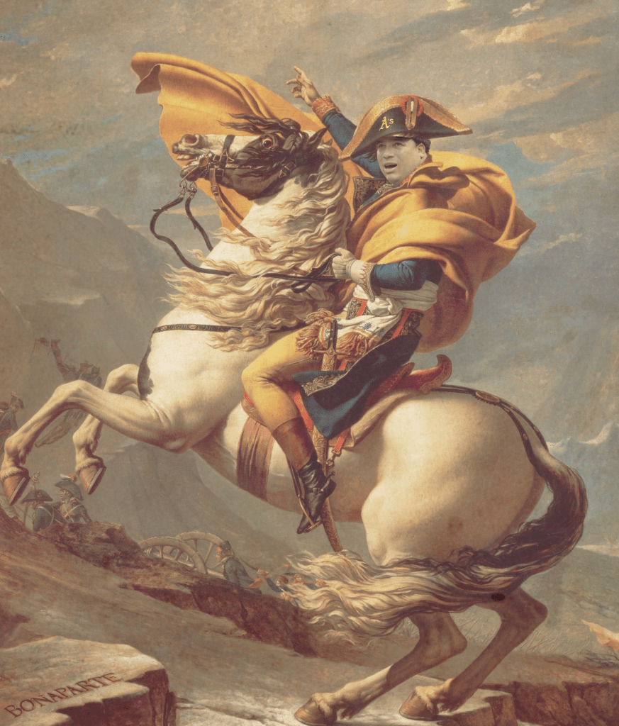
I hope my composite image communicates to the viewer the longevity of Bartolo Colon by comparing him to Napoleon. This is because Napoleon conquered many territories and Bartolo had conquered almost every team in Professional baseball world wide. My piece is making the statement that culture today still has some people who live the old school way of life like Bartolo as a leader. The main reason why I chose my image was because Bartolo had won a game that he pitched against every team in his Major Leaugue career like Napoleon who conquered almost every area in sight. One key piece of advice that I would give to a person looking to create a composite image in Photoshop would be to use Hue and Saturation very well. I say this because you can use it to match the photoshopped part with the original photo. Also using a background with a low opacity is a great touch.
I like the action going on. It depicts a lot of emotion. I also like the variety of colors.
I’m not sure if he put on a texture layer or not. But if he had put one on it would have added the old look to the photo. Besides that, it is pretty good.
I would try to make the cut of his face and the body of Napoleon a little smoother. It looks very harsh. You should try to focus more on blending it in.
I like Blake’s color grading. He uses it to blend the player’s face onto Napoleon’s body well. Also, I know that he enjoys baseball, so he incorporated his interests into the picture.
One thing that could be better in Blake’s photo is his choice of photo. The baseball player in his photo does not match the body of Napoleon very well. I think he should rechoose his photo.
I would spend more time looking for a better photo to photoshop. Also, it could use a little more baseball. A good idea would be to photoshop a baseball glove on Napoleon’s head.