


1. What strengths and weaknesses do you see in your own work? One strength I see is that I believe I can take good photos with good angles. I believe I am able to get good shots so I can minimize the amount of editing I have to do. A big weakness I see in my work is my ability to edit and fix the colors in the shots.
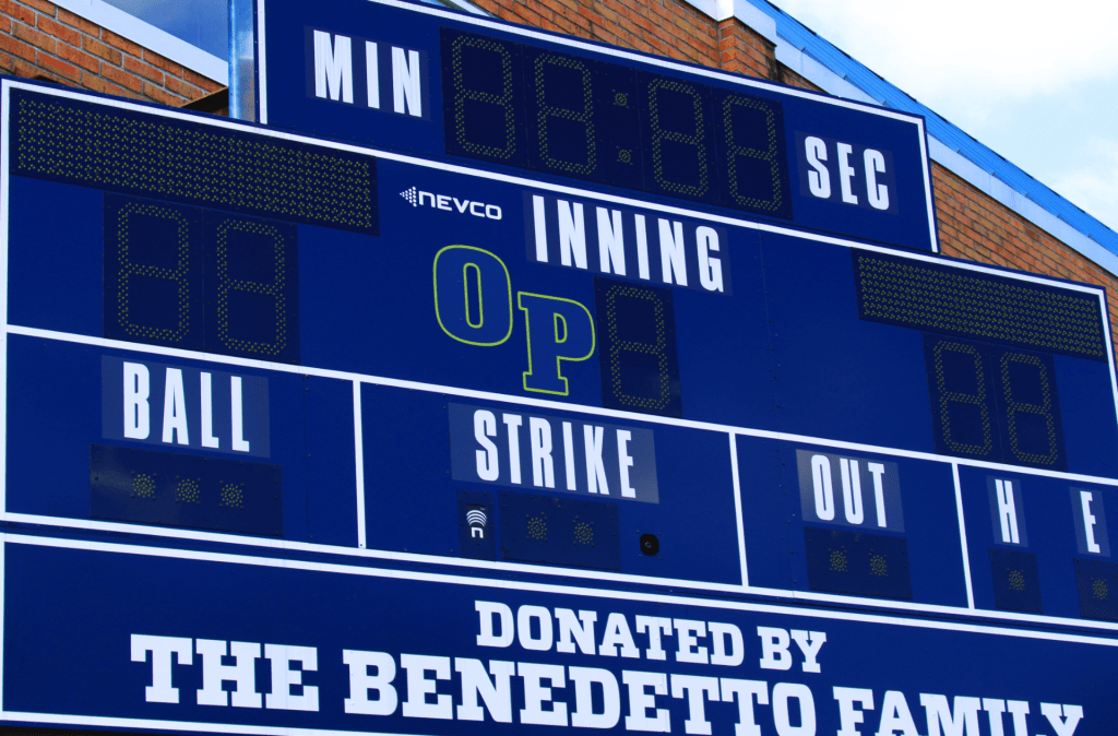
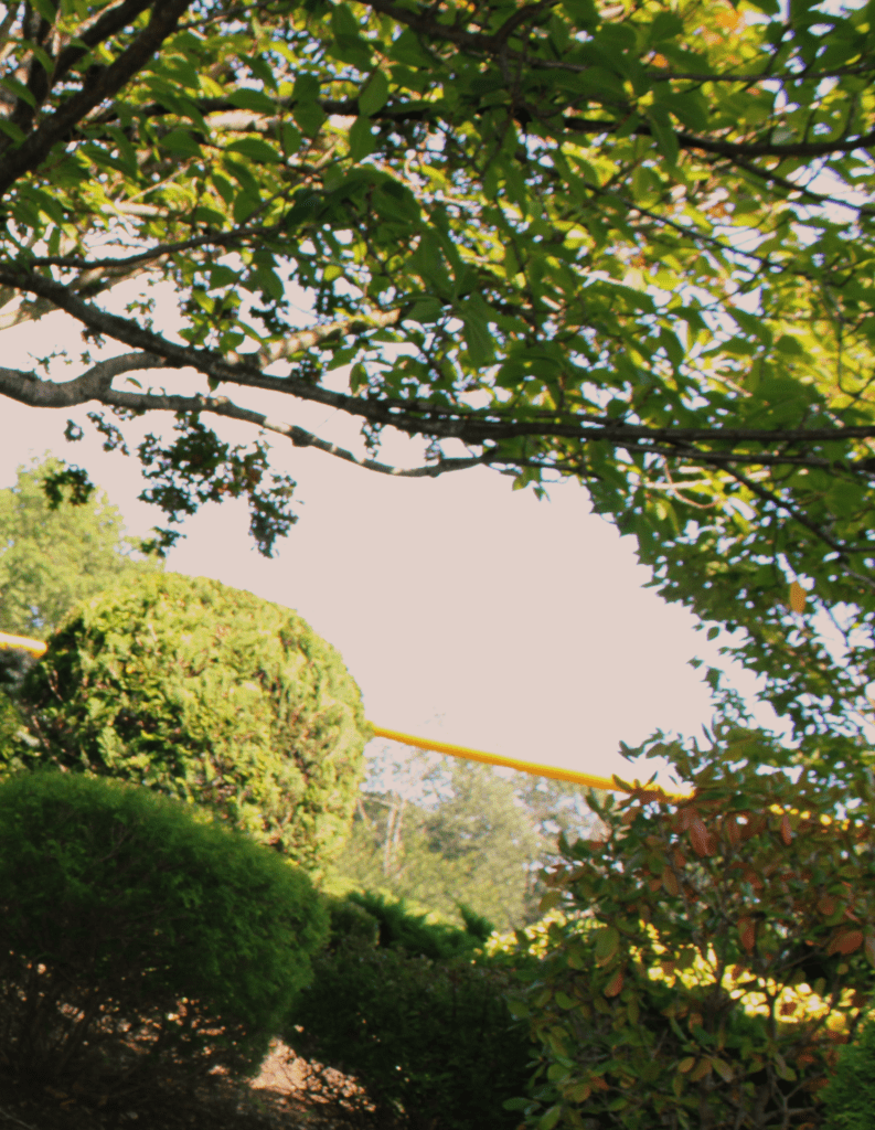
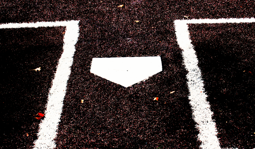
2. How might you improve or refine your approach in future photography projects? I might refine my approach in my future photography projects by taking more photos of nature. I took a lot of photos of people and objects and I believe that taking more photos of nature could speak to more people. I also believe I could include more color in my photos. The photo I believe the color looks the best is the scoreboard, if I could get every photo like that it would be amazing.
3. Pick one of your photos, what emotions or messages did you intend to convey through this photograph? The photo of the baseball conveys the emotion of happiness. I believe this because the photo has a very up beat mood in the sense that it is decently bright and you can see all of the seams on the ball. I also like the way the turf looks because the texture is so prevalent that it looks like you could actually be on the field playing the game.
4. Are there specific elements of art you would like to explore further in your photography? I would further like to explore the element of texture. I would like to explore texture because I really like how my texture photo came out with the baseball and I feel I could even get better shots. I also believe I can find more examples of natural shapes and take more shots of that.
5. What concepts or techniques do you want to experiment with in your next project? I would like to test out different angles in my next project. I believe I took maybe too many photos with a birds eye view, and if I mix in a few photos with a worms eye view it would be the photos look even more unique. I would also like to test photos with a lens with a better zoom. I think if I were to have more zoom on some photos I could exploit the color and textures and make it look better.
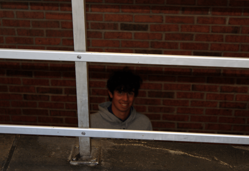
The two photos I liked the most were his second shape picture and his space picture. I love how nice they came out and the effort he put into it. The space has a clear focal point and the blurry background really helps accentuate his subject. Something that I thought was lackluster was his first take upon shape. The photo is blurry and there is no clear identifiable focal point. One composition technique I found within one of his works was SYMMETRY found within his other shape photo.
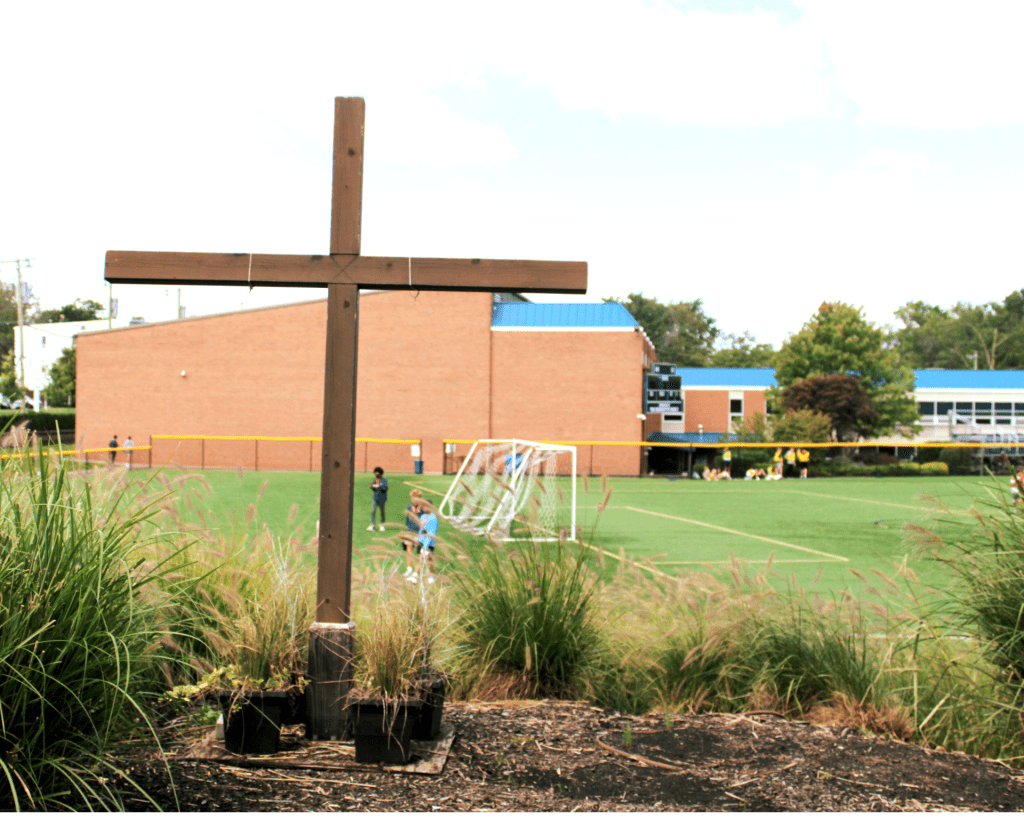
My two favorite photos are texture and space. His picture of texture really shows the texture of the baseball well. It is also photoshopped very well, further enhancing the quality of the picture. I also like his photos of space. The picture of the oratory symbol in DeGaeta is very unique as the background fades away. One photo that could be better is the picture about shape. It is slightly blurry and the focus of the photo is unclear. The composition technique used in the texture photo is Fill the Frame because the picture is close up showing the texture of the baseball.
The two Photos I liked best in this series were line and value. I liked the line photo because it was well edited. I liked the value photo for the color contrast. One photo in the series that could be better was the form photo. It was slightly crude. It was also very harshly lit. One composition technique used was to fill the frame. This is because the value photo was close to it’s subject.
The color picture was really sightful and gives a great contrast between the color of the brick wall and the sky in the background. I also really liked the shape photo because the shapes are clearly distinguished. Next time, for a photo like LINE, I wouldn’t retouch too much because then the photo starts to look really artificial and not as much natural. The composition technique used in the man-made line is DIAGONAL LINES because the flag blowing creates the illusion of diagonal lines and movement.